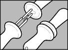
[Update August 17] Totally cool, these cornholders I worked on for Zyliss were just reviewed in the New York Times, two weeks after my blog entry. Coincidence? You decide.
From the article:
"How is a corn holder like a sock? No, this is not the first line of an absurdist joke. The serious answer, courtesy of the product development team at Zyliss USA, a kitchen tools maker, is that neither item is useful on its own. Just as socks come in pairs, so too must corn holders; lifting a cob with a single holder can end only in frustration.
"Mr. Gerber says that many parents have praised the product, not only because it lessens the chances of a painful poke, but also because it provides entertainment value. "It's a little bit of a toy," he said. "You have it in your hands, and you have to pull it apart and then put it together."
"In this way, too, corn holders are rather like socks. Anyone who has ever turned a tube sock into a cheerful puppet can attest to that."

[original post: Aug 2, 2005] My goal in designing a product is simplicity. Perhaps because I spent years doing engineering on robots and satellites, I've really come to appreciate not overdoing a thing. Instead, I'd rather distill an idea into its most deceptively basic incarnation, so that it stays true to what it was designed to be, and doesn't try to be something else.
Simple doesn't mean easy. Often, you have to start with complex solutions, and then reduce them down to simplicity. A good case study: the corn holders IDEO designed for Zyliss. These corn holders do just two things: First, of course, they hold ears of corn. Second, they nest together in pairs when not being used. That's it. They don't try to look like corn. They dont try to look classic, or cute, or gadgety. They don't give you a rubber grip, because, really, it's corn. They just hold the corn when you need them to, and nest together when you're done. Why nest in pairs? I imagined my toddler digging thru the kitchen knick-knack drawer, poking his little fingers on inconsiderate corn holders. I needed a way for corn holders not to be so dangerous. Nesting these holders hides the sharp ends of the prongs. This is great for fingers, small and large. It turns out that nesting these corn holders in pairs also helps organization: matched pairs stay together, no odd bit left in the drawer.My first idea was for each corn holder's prongs to flip in and out, like a pocket knife. But, even with only three or four parts, there were too many extra parts and motions in hiding and revealing the prongs. Same with other 'actions' to collapse the holders like little machines. Who wants something as simple as a corn holder to become as complex as a corkscrew?The idea to nest the holders came after. Much simpler: No moving parts. By adding features in the plastic body of one holder to accept the prongs of the other, you could tuck away the sharp points, without adding any new parts or complexity. This was the right path, the appropriate amount of simplicity.Our industrial designer took the concept and improved on it. He gave it an elegant form, echoing the purposeful design language of our previous work with Zyliss. We also moved the nesting feature to the core of the form, simplifying the concept even more. When nested, each holder completely hides the prongs of its mate. The pair is secure, and complete. Its simple form conveys this fact.Just this afternoon, I heard a talk from one of our London designers about some work they've recently done for a well known Italian brand. Simplicity was the key phrase she used as well, to describe the design intent of their work. It's definitely one continuing theme in the IDEO aesthetic.
Labels: design, simplicity


